Timeline
5 Weeks
Role
UX/UI Designer & Researcher
Project
End to End Mobile App
Tools
Figma, Zoom, Figjam, Photoshop
Introduction
What is WalkSafe?
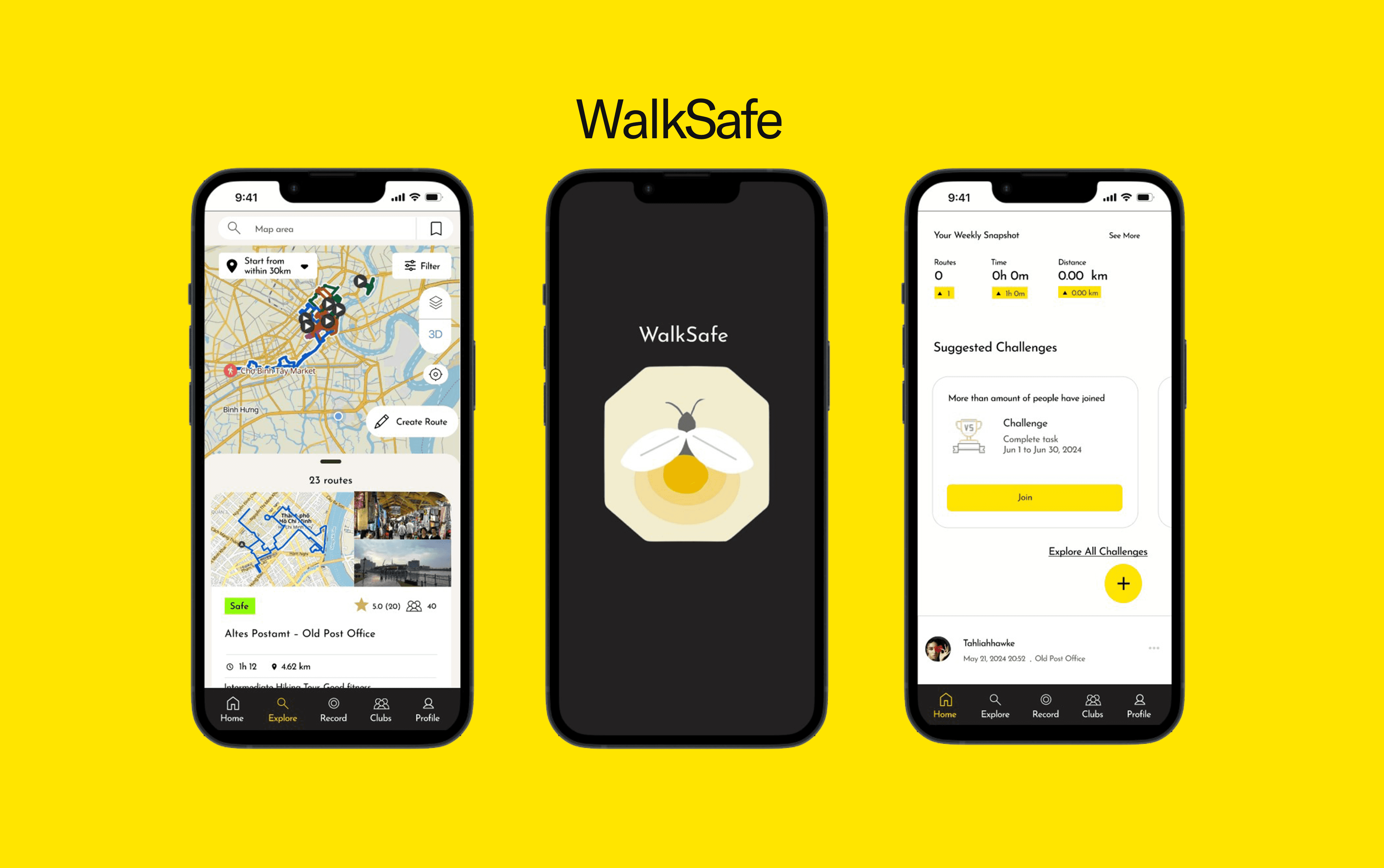
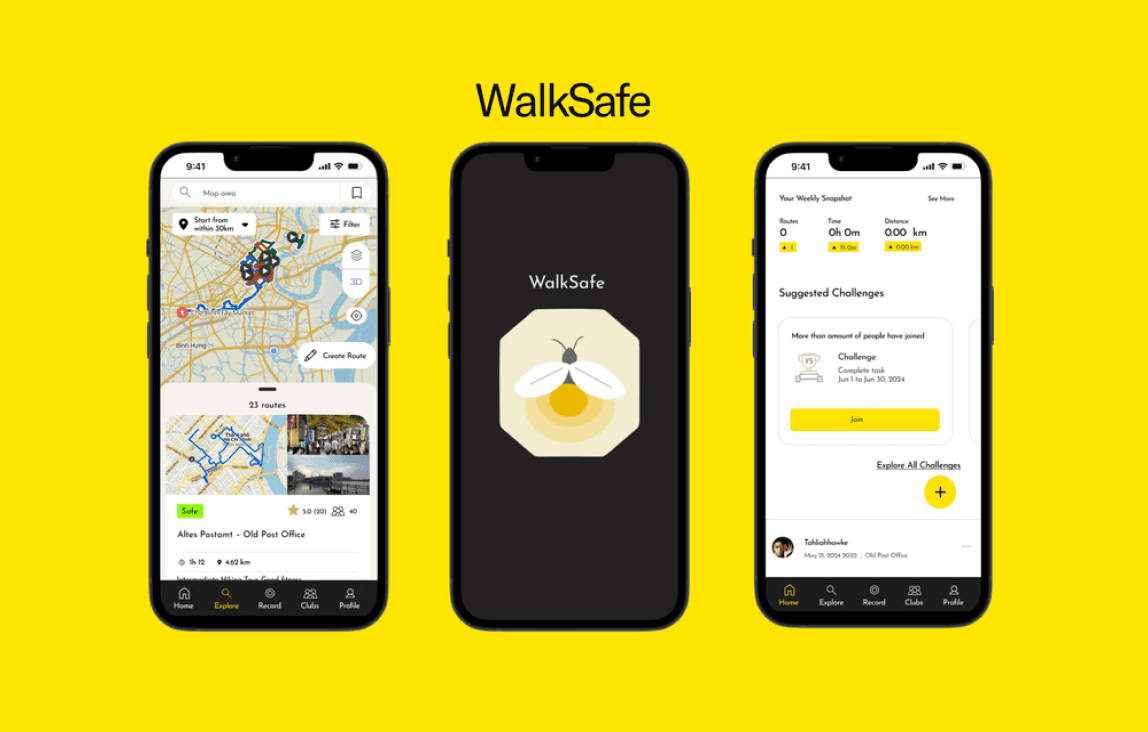
WalkSafe is a comprehensive mobile application designed with the primary goal of ensuring the safety of users while they navigate walking routes. This end-to-end app provides a range of features and services that collectively create a safer and more informed walking experience.
Context
The Initial Curiosity
I wanted to know what stopped people from walking. I wondered if it was due to urban planning and living in a walkable city, weather, limited time, or mental health. So I interviewed people who lived in walkable cities and suburban neighborhoods.
Instead I found a surprising reason
The Problem
Safety
Walkers had previous experiences of harassment and unsafe conditions of a walking route and were less likely to take a walking route from which they were unfamiliar
The Solution
A Safety Filter
Equipped with a customized safety filter, the cautious walker can pick and choose what factors into their walking experience
Why WalkSafe?
According to a Gallup poll
40% of Americans fear walking alone at night
The Bureau of Justice Statistics reported
Over 2.8 million incidents of street crimes in the United States
The AARP found that
40% of adults over 50 would walk more if they felt safer in their neighborhood
But where did we start from?
The Process
Deep Dive
Competitor Analysis
User Interviews
2.Define
Affinity Map
User Persona
3.Thinking
HMW
Feature Roadmapping
Task Flow
Branding+ UI Kit
4.Assembling
Lo-Fi Wireframes
Mid-Fidelity
High Fidelity
5.Redefine
Usability Testing
Design Decisions
6.Delivery
Final Screens
Next Steps
Reflection
1
Deep Dive
The Competition
Competitive Analysis

Strava

Alltrails

Komoot
From researching the competitive landscape, I learned the importance of simplified navigation, community feedback and data, personalization, and customization. Yet these apps lacked a focus on safety and informing walkers of safety conditions of walking routes.
Don’t take it from just the competition. I also learned from our...
User Interviews
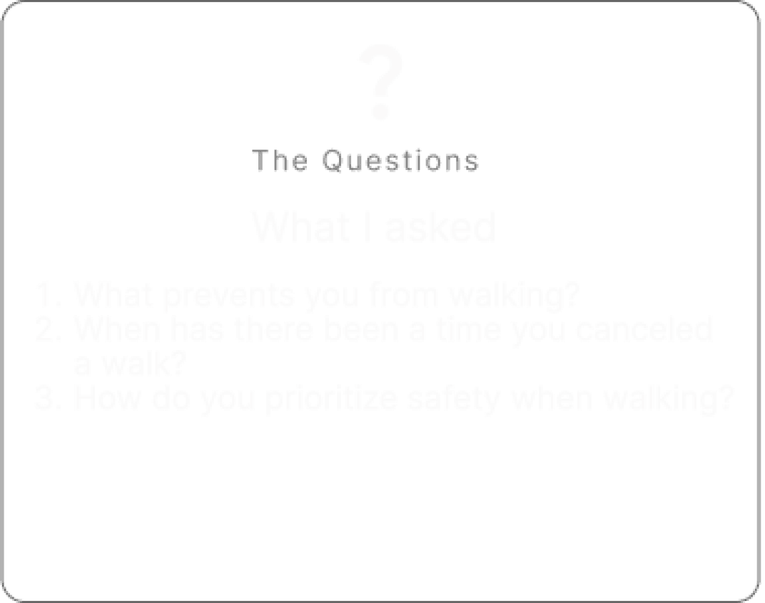
The Questions
What I asked
What prevents you from walking?
When has there been a time you canceled a walk?
How do you prioritize safety when walking?
The Responses
What I heard
“Not knowing if I’ll be harassed”
“I avoided walking down this route because it was too dim and at night”
“I take the longer route because it's more familiar to me “
2
Define
I compiled the research into the form of an...
Synthesizing the Research
Affinity Map
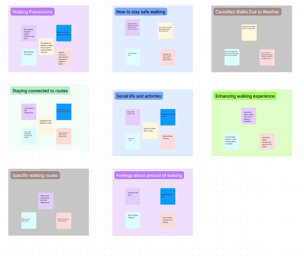
Initially finding a pattern was difficult, but after mapping out the responses it was easier
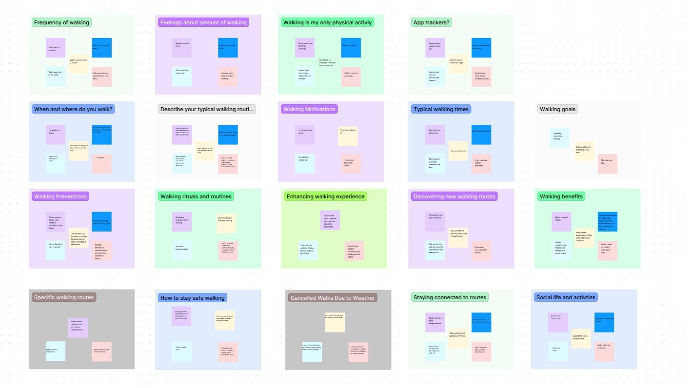
After synthesizing the responses, I broke down the map into a smaller cluster of maps

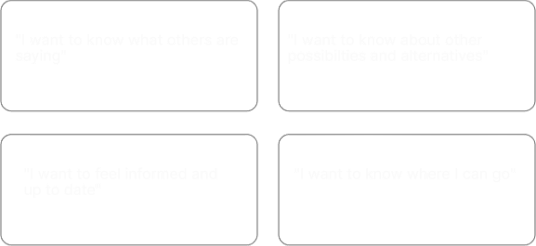
4 insights emerged as a result of the affinity mapping.
What I learned
The Insights

From there I compiled all the data into the cautious walker. The cautious walker was developed through an analysis of the user interivews. By identifying common behaviors and responses among users, I was able to craft a persona that encapsulates the typical user's needs and motivations. For example, the cautious walker revealed to me key safety concerns such as poor lightning and high traffic.
User Persona

Visualizing the cautious walker in mind helped the process be less abstract and be more material and real. This steps compelled me to think of a central question.
The Problem Statement
Safety
The cautious walker needs to know about the conditions of walking routes so that they can ensure their safety.
3
Thinking
Brainstorming Session
HMW
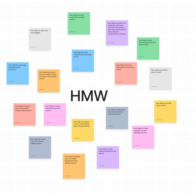
I brainstormed several HMW questions and landed on a central question...
The HMW
How might we know about the conditions of a walking route?
The HMW statement became a focal point in which I could direct potential ideas and solutions. I had a brainstorming session to ideate. These ideas were evaluted and prioritized based on feasibility, impact, and user needs. The proces of brainstorming and filtering were developed through a
Impact vs Effort Matrix
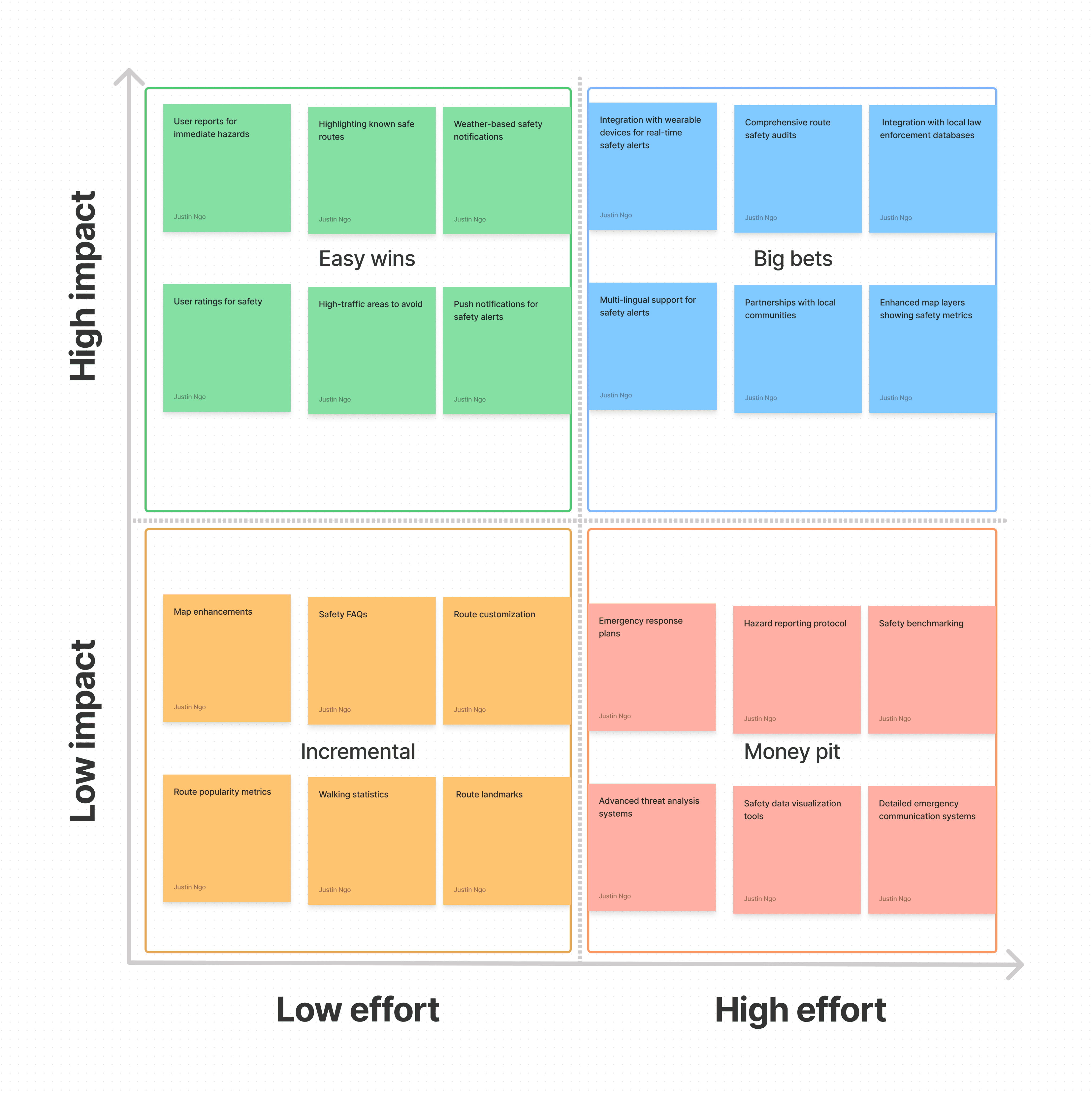
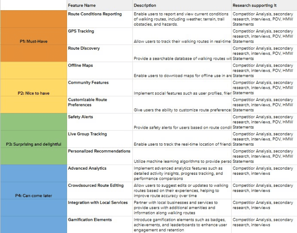
The outcomes of the ideation matrix included a well-defined set of prioritized features and functionalities. Key outcomes included the development of a safety filter, reviews, indicator for safety, and customizable routes. Additionally, the matrix helped us identify potential challenges and refined our feature roadmap to enhance the cautious walker's experience. The results of which can be seen below in the
Feature Roadmap

The results of the feature roadmap provided a clear direction for development. The roadmap ultimately guided the creation of the '
User Flow

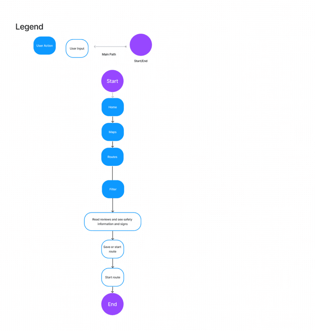
The flow highlights esential interactions for the user experience. By mapping out these interactions, I can create a seamless and intuitive user experience, ensuring that the design effectively meets the users' need for safety and convenience while walking.
And created the...
What do we want walkers to feel?
Branding

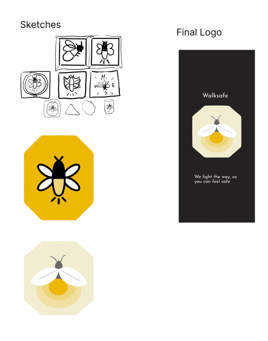
I wanted the walker to feel cozy and welcomed. I thought about the symbolism of other objects and animals. I landed on the firefly after remembering an illustration I saw.
The branding was further developed through a
UI Kit
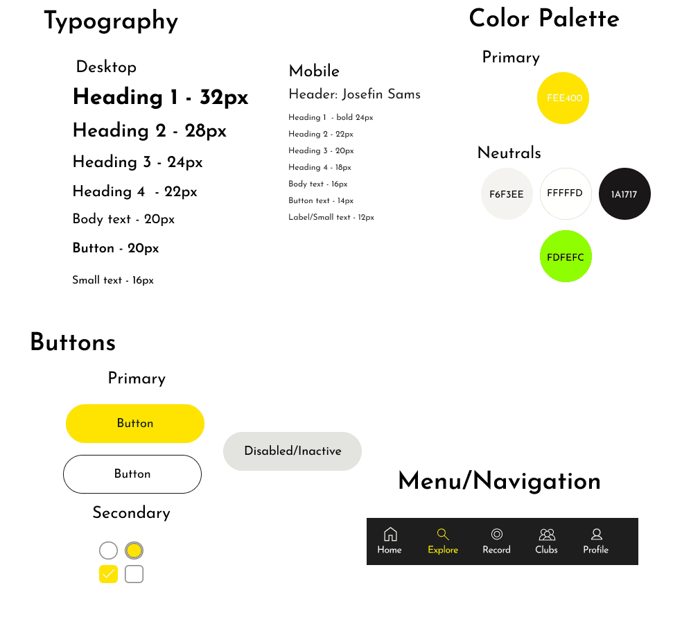
The UI Kit helped me to reuse components and elements with the design and with that I was able to move onto the next step.
4
Assembling
Lo-Fi Wireframes


The transition between the lo-fi wireframes and mid-fi wireframes left room for design to be experimented, realized, and changed.
Mid-Fi Wireframes
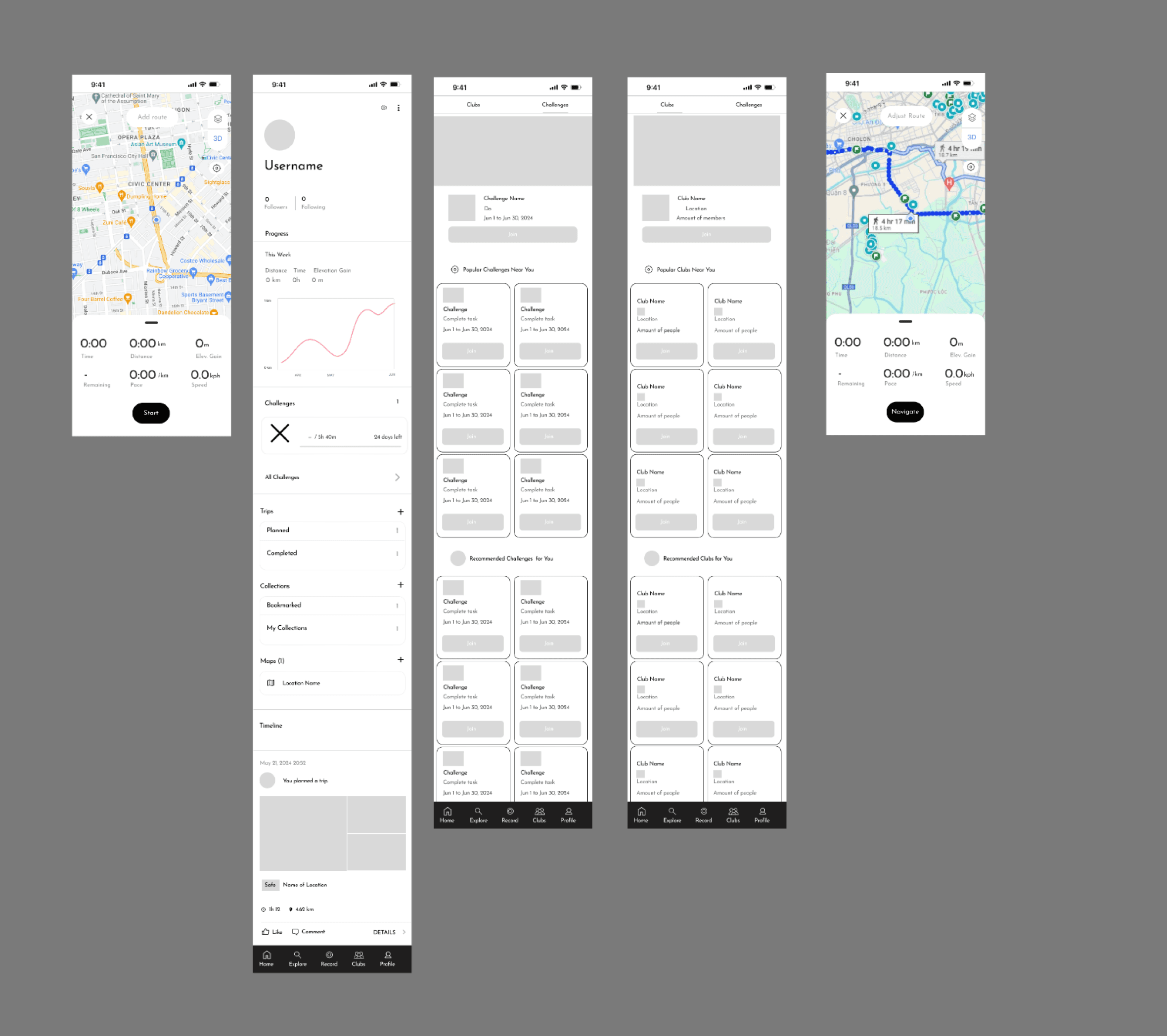
Through usability testing the mid-fi wireframes, I was able to learn what needed to be changed and create the
High-Fi Wireframes

5
Redefine
What I tested
Usability Testing
I prompted the participants to filter a route that was a close to the police station and to start the navigation.
Success Metrics
100 % task completion rate
4 minute task time
Few errors or misclicks
4 out of 5 star rating for satsifaction and understanding
Results
100 % task completion rate
3 minute task time on average
All users had few errors or misclicks
4.5 star rating for satsifaction and understanding
Iterations
Design Decisions
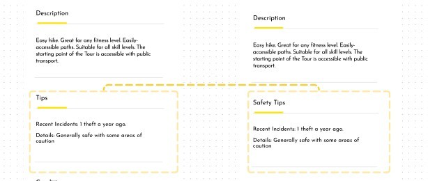
After noticing users not being able to find the tips, I rephrased the language to be more clear to the user

I also noticed users confused by the language of time of day and asking questions about it

Then I noticed how participants had a hard time with the amount of buttons in the screen. Other changes from the usability test included consistent UI elements across screens.
6
Delivery
Prototype
Final Screen
Final Screens

Next Steps
Create more task flows with additional features
Explore more designs
Explore more user testing for additional features and task flows
Reflection
The value of user research and interviews. Asking the right questions and taking the time with participants is valuable.
I struggled with feedback but I learned to overcome by asking for specific feedback and for help because asking for help isn’t bad. Designers continuously are learning and have their own strengths and weaknesses.
Designing an app and feature is challenging. Taking it one step at a time and breaking it down into more manageable tasks is key to success.
@2024 Justin Ngo
Table of Content


5 Weeks
Timeline
Role
UX/UI Designer &
Researcher
Project
End to End Mobile App
Tools
Figma, Zoom,
Figjam, Photoshop
Introduction
What is WalkSafe?
WalkSafe is a comprehensive mobile application designed with the primary of ensuring the safety of users while they navigate walking routes. This end-to-end app provides a range of features and services that collectively create a safer and more informed walking experience.
Context
The Initial Curiosity
I wanted to know what stopped people from walking. I wondered if it was due to urban planning and living in a walkable city, weather, limited time, or mental health. So I interviewed people who lived in walkable cities and suburban neighborhoods.
Instead I found a surprising reason
The Problem
Safety
Walkers had previous experiences of harassment and unsafe conditions of a walking route and were less
likely to take a walking route from which they were unfamiliar
The Solution
A Safety Filter
Equipped with a customized safety filter, the cautious walker can pick and choose what factors into their walking experience
Why WalkSafe?
According to a Gallup poll
40%
of Americans fear
walking alone at night
The Bureau of Justice
Statistics reported
Over
2.8 million
incidents
of street crimes in the United
States
The AARP found that
40%
of adults over 50 would
walk more if they felt safer in
their neighborhood
But where did we start from?
Deep Dive
Competitor Analysis
User Interviews
2.Define
Affinity Map
User Persona
3.Thinking
HMW
Feature Roadmapping
Task Flow
Branding+ UI Kit
4.Assembling
Lo-Fi Wireframes
Mid-Fidelity
High Fidelity
5.Redefine
Usability Testing
Design Decisions
6.Delivery
Final Screens
Next Steps
Reflection
The Process
Brainstorming Session
HMW
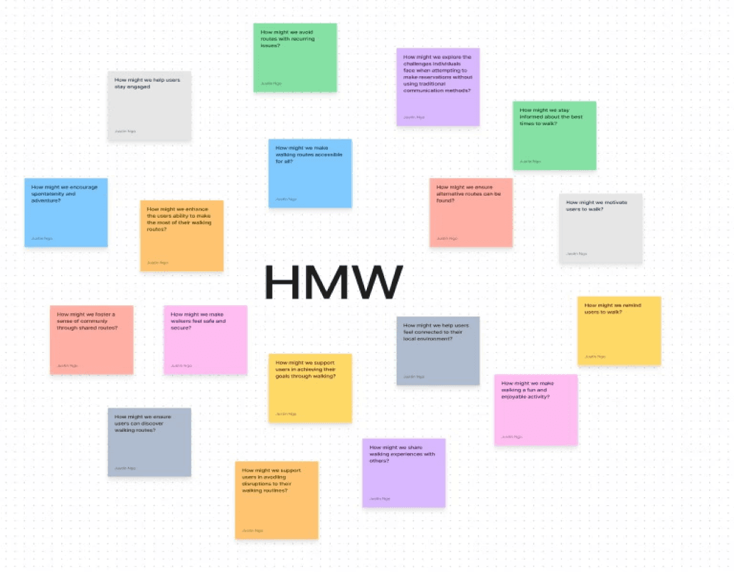

The HMW statement became a focal point in which I could direct potential ideas and solutions. I had a brainstorming session to ideate. These ideas were evaluted and prioritized based on feasibility, impact, and user needs. The proces of brainstorming and filtering were developed through a
Impact vs Effort Matrix

Feature Roadmap
User Flow
What do we want walkers to feel?
Branding
I brainstormed several HMW questions and landed on a central question...
The outcomes of the ideation matrix included a well-defined set of prioritized features and functionalities. Key outcomes
included the development of a safety filter, reviews, indicator for safety, and customizable routes. Additionally, the matrix helped us identify potential challenges and refined our feature roadmap to enhance the cautious walker's experience. The results of which can be seen below in the
The flow highlights esential interactions for the user experience. By mapping out these
interactions, I can create a seamless and intuitive user experience, ensuring that the
design effectively meets the users' need for safety and convenience while walking.
And created the...
The results of the feature roadmap provided a clear direction for development. The roadmap ultimately guided the
creation of the
I wanted the walker to feel cozy and welcomed. I thought about the symbolism of other objects and
animals. I landed on the firefly after remembering an illustration I saw.
The branding was further developed through a
The UI Kit helped me to reuse components and elements with the design and with that I was able to move onto the next step.
UI Kit

1
Deep Dive
2
Define
The Competition
Competitive Analysis

Strava

Alltrails

Komoot
From researching the competitive landscape, I learned the importance of simplified navigation, community feedback and data, personalization, and customization. Yet these apps lacked a focus on safety and informing walkers of safety conditions of walking routes.
Don’t take it from just the competition. I also learned from our...
User Interviews
Lo-Fi Wireframes


High-Fi Wireframes

What I tested
Usability Testing
I prompted the participants to filter a route that was a close to the police station and to start the navigation.
Success Metrics
100 % task completion rate
4 minute task time
Few errors or misclicks
4 out of 5 star rating for satsifaction and understanding
Results
100 % task completion rate
3 minute task time on average
All users had few errors or misclicks
4.5 star rating for satsifaction and understanding
Iterations
Design Decisions

After noticing users not being able to find the tips, I rephrased the language to be more clear to the user
I also noticed users confused by the language of time of day and asking questions about it
Then I noticed how participants had a hard time with the amount of buttons in the screen. Other changes from the usability test included consistent UI elements across screens.


I compiled the research into the form of an...
Synthesizing the Research
Affinity Map
What I learned
The Insights
User Persona

Visualizing the cautious walker in mind helped the process be less abstract and be more material and
real. This steps compelled me to think of a central question.
The Problem Statement
Safety
The cautious walker needs to know about the conditions of walking routes so that they can ensure their
safety.
Initially finding a pattern was difficult, but after mapping out the responses it was easier
After synthesizing the responses, I broke down the map into a smaller cluster of maps
4 insights emerged as a result of the affinity mapping.

From there I compiled all the data into the cautious walker. The cautious walker was developed through an analysis of
the user interivews. By identifying common behaviors and responses among users, I was able to craft a persona that
encapsulates the typical user's needs and motivations. For example, the cautious walker revealed to me key safety
concerns such as poor lightning and high traffic.
3
Thinking
The transition between the lo-fi wireframes and mid-fi wireframes left room for design to be experimented, realized, and changed.
Through usability testing the mid-fi wireframes, I was able to learn what needed to be changed and create the
Through usability testing the mid-fi wireframes, I was able to learn what needed to be changed and create the final screens.
5
Redefine
4
Assembling
6
Delivery
Next Steps
Create more task flows with additional features
Explore more designs
Explore more user testing for additional features and task flows
Reflection
The value of user research and interviews. Asking the right questions and taking the time with participants is valuable.
I struggled with feedback but I learned to overcome by asking for specific feedback and for help because asking for help isn’t bad. Designers continuously are learning and have their own strengths and weaknesses.
Designing an app and feature is challenging. Taking it one step at a
time and breaking it down into more manageable tasks is key to success.
@2024 Justin Ngo


5 Weeks
Timeline
Role
UX/UI Designer &
Researcher
Project
End to End Mobile App
Tools
Figma, Zoom,
Figjam, Photoshop
Introduction
What is WalkSafe?
WalkSafe is a comprehensive mobile application designed with the primary of ensuring the safety of users while they navigate walking routes. This end-to-end app provides a range of features and services that collectively create a safer and more informed walking experience.
Context
The Initial Curiosity
I wanted to know what stopped people from walking. I wondered if it was due to urban planning and living in a walkable city, weather, limited time, or mental health. So I interviewed people who lived in walkable cities and suburban neighborhoods.
Instead I found a surprising reason
The Problem
Safety
Walkers had previous experiences of harassment and unsafe conditions of a walking route and were less
likely to take a walking route from which they were unfamiliar
The Solution
A Safety Filter
Equipped with a customized safety filter, the cautious walker can pick and choose what factors into their walking experience
Why WalkSafe?
According to a Gallup poll
40%
of Americans fear
walking alone at night
The Bureau of Justice
Statistics reported
Over
2.8 million
incidents
of street crimes in the United
States
The AARP found that
40%
of adults over 50 would
walk more if they felt safer in
their neighborhood
But where did we start from?
Deep Dive
Competitor Analysis
User Interviews
2.Define
Affinity Map
User Persona
3.Thinking
HMW
Feature Roadmapping
Task Flow
Branding+ UI Kit
4.Assembling
Lo-Fi Wireframes
Mid-Fidelity
High Fidelity
5.Redefine
Usability Testing
Design Decisions
6.Delivery
Final Screens
Next Steps
Reflection
The Process
Brainstorming Session
HMW


The HMW statement became a focal point in which I could direct potential ideas and solutions. I had a brainstorming session to ideate. These ideas were evaluted and prioritized based on feasibility, impact, and user needs. The proces of brainstorming and filtering were developed through a
Impact vs Effort Matrix

Feature Roadmap

User Flow

What do we want walkers to feel?
Branding

I brainstormed several HMW questions and landed on a central question...
The outcomes of the ideation matrix included a well-defined set of prioritized features and functionalities. Key outcomes
included the development of a safety filter, reviews, indicator for safety, and customizable routes. Additionally, the matrix helped us identify potential challenges and refined our feature roadmap to enhance the cautious walker's experience. The results of which can be seen below in the
The flow highlights esential interactions for the user experience. By mapping out these
interactions, I can create a seamless and intuitive user experience, ensuring that the
design effectively meets the users' need for safety and convenience while walking.
And created the...
The results of the feature roadmap provided a clear direction for development. The roadmap ultimately guided the
creation of the
I wanted the walker to feel cozy and welcomed. I thought about the symbolism of other objects and
animals. I landed on the firefly after remembering an illustration I saw.
The branding was further developed through a
The UI Kit helped me to reuse components and elements with the design and with that I was able to move onto the next step.
UI Kit

1
Deep Dive
2
Define
The Competition
Competitive Analysis

Strava

Alltrails

Komoot
From researching the competitive landscape, I learned the importance of simplified navigation, community feedback and data, personalization, and customization. Yet these apps lacked a focus on safety and informing walkers of safety conditions of walking routes.
Don’t take it from just the competition. I also learned from our...
User Interviews


Lo-Fi Wireframes


High-Fi Wireframes

What I tested
Usability Testing
I prompted the participants to filter a route that was a close to the police station and to start the navigation.
Success Metrics
100 % task completion rate
4 minute task time
Few errors or misclicks
4 out of 5 star rating for satsifaction and understanding
Results
100 % task completion rate
3 minute task time on average
All users had few errors or misclicks
4.5 star rating for satsifaction and understanding
Iterations
Design Decisions

After noticing users not being able to find the tips, I rephrased the language to be more clear to the user
I also noticed users confused by the language of time of day and asking questions about it
Then I noticed how participants had a hard time with the amount of buttons in the screen. Other changes from the usability test included consistent UI elements across screens.


I compiled the research into the form of an...
Synthesizing the Research
Affinity Map
What I learned
The Insights

User Persona

Visualizing the cautious walker in mind helped the process be less abstract and be more material and
real. This steps compelled me to think of a central question.
The Problem Statement
Safety
The cautious walker needs to know about the conditions of walking routes so that they can ensure their
safety.
Initially finding a pattern was difficult, but after mapping out the responses it was easier
After synthesizing the responses, I broke down the map into a smaller cluster of maps
4 insights emerged as a result of the affinity mapping.


From there I compiled all the data into the cautious walker. The cautious walker was developed through an analysis of
the user interivews. By identifying common behaviors and responses among users, I was able to craft a persona that
encapsulates the typical user's needs and motivations. For example, the cautious walker revealed to me key safety
concerns such as poor lightning and high traffic.
3
Thinking
The transition between the lo-fi wireframes and mid-fi wireframes left room for design to be experimented, realized, and changed.
Through usability testing the mid-fi wireframes, I was able to learn what needed to be changed and create the
Through usability testing the mid-fi wireframes, I was able to learn what needed to be changed and create the final screens.
5
Redefine
4
Assembling
6
Delivery
Next Steps
Create more task flows with additional features
Explore more designs
Explore more user testing for additional features and task flows
Reflection
The value of user research and interviews. Asking the right questions and taking the time with participants is valuable.
I struggled with feedback but I learned to overcome by asking for specific feedback and for help because asking for help isn’t bad. Designers continuously are learning and have their own strengths and weaknesses.
Designing an app and feature is challenging. Taking it one step at a
time and breaking it down into more manageable tasks is key to success.
@2024 Justin Ngo
