Timeline
6 Weeks
Role
UX/UI Designer & Researcher
Project
Desktop and tablet redesign
Tools
Figma, Zoom, Figjam, Photoshop
What is MyStory?
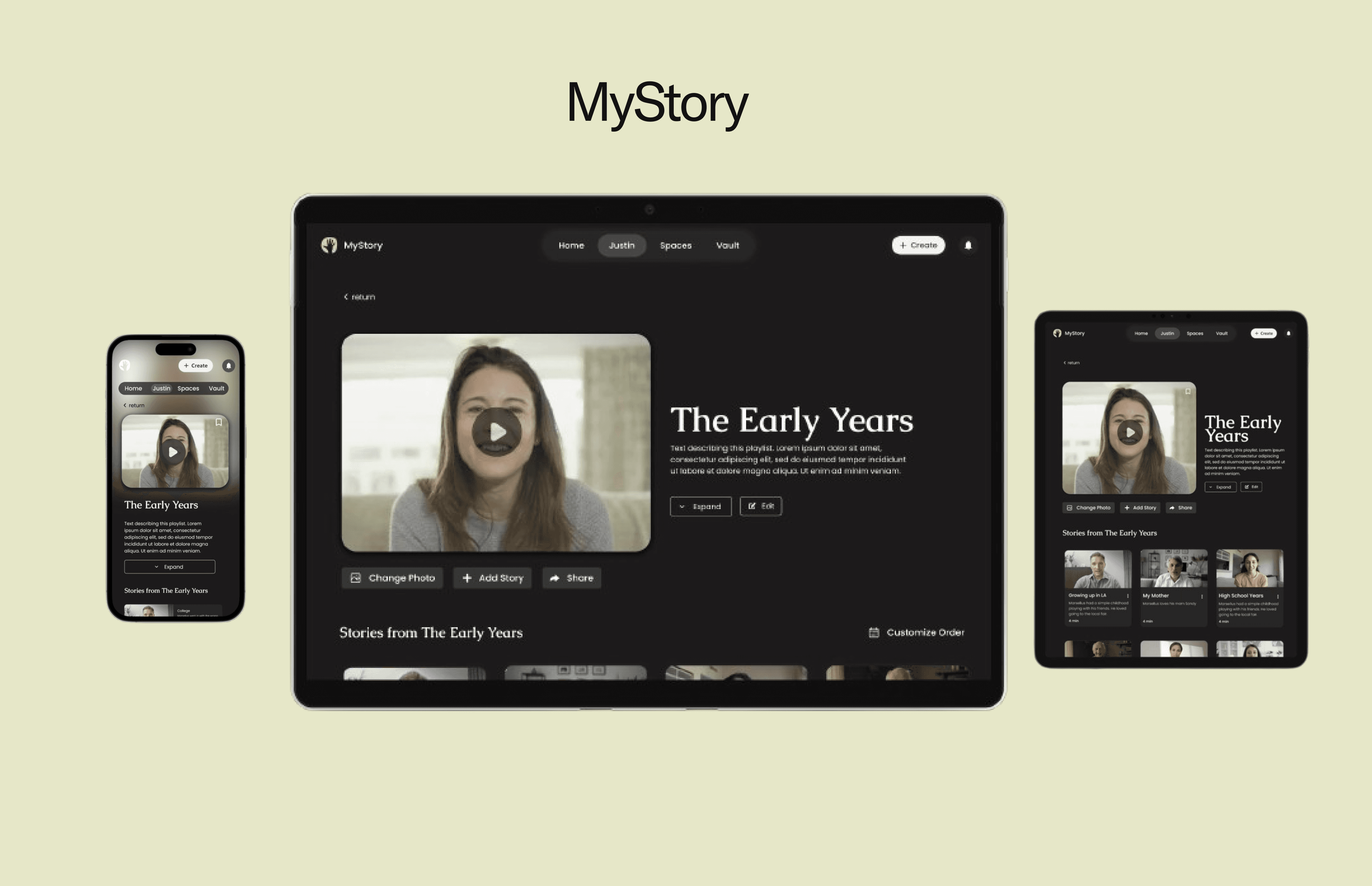
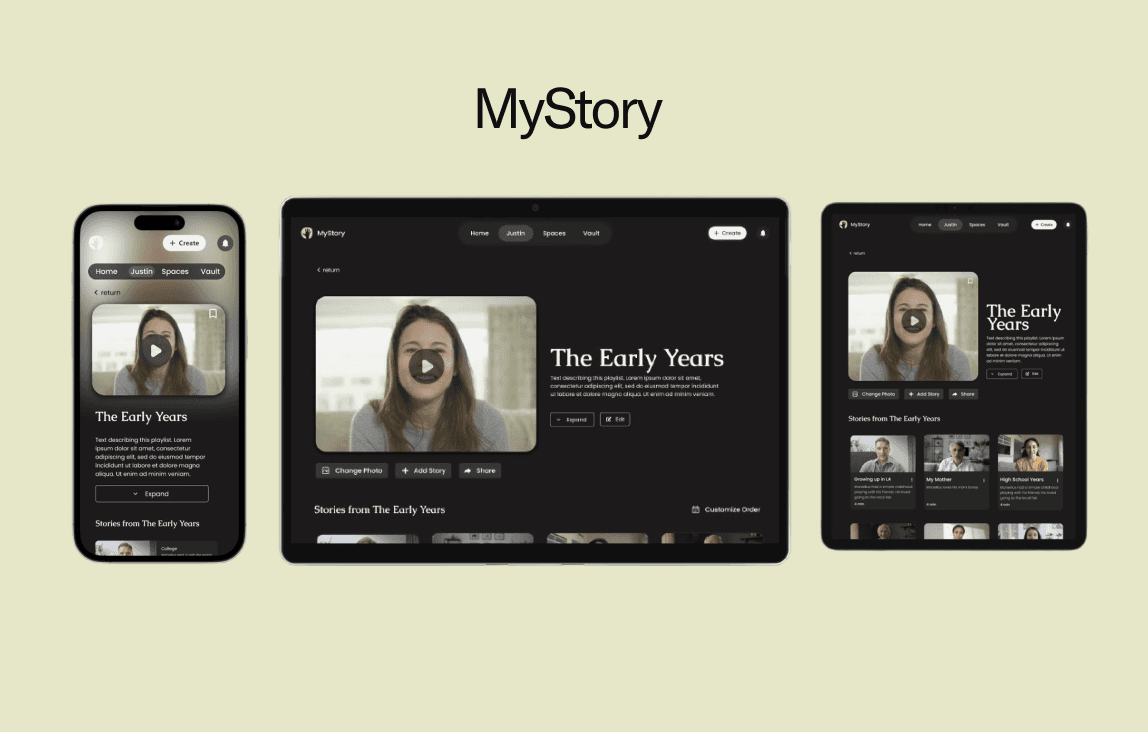
MyStory is a legacy documentation platform aiming to help users create and share their life stories.
The Initial Investigation
I wanted to explore how to redesign MyStory to create an accessible platform that caters to both older users and younger users familiar with modern digital experiences
I thought of finding similar platforms would help instead I found out a simpler solution.
Simplifying Flows
Alongside the stakeholders and designers, we researched and found critical gaps in the user experience. We found the inital flow of the platform left too many users disengaged, especially when it came to storytelling and sharing. To reduce the drop-off rate we simplified the flow and left more flexibility for non-linear storytelling and structure.
But where did we start from?
The Process
1.Deep Dive
Competitor Analysis
2.Defining
Sitemap
User Flow
3.Assembling
Lo-Fi Wireframes
Mid-Fi Wireframes
High-Fi Wireframes
Design Decisions
4.Delivery
Final Screens
Reflection
1
Deep Dive
The Competition
Competitive Analysis


Storyworth

Youtube
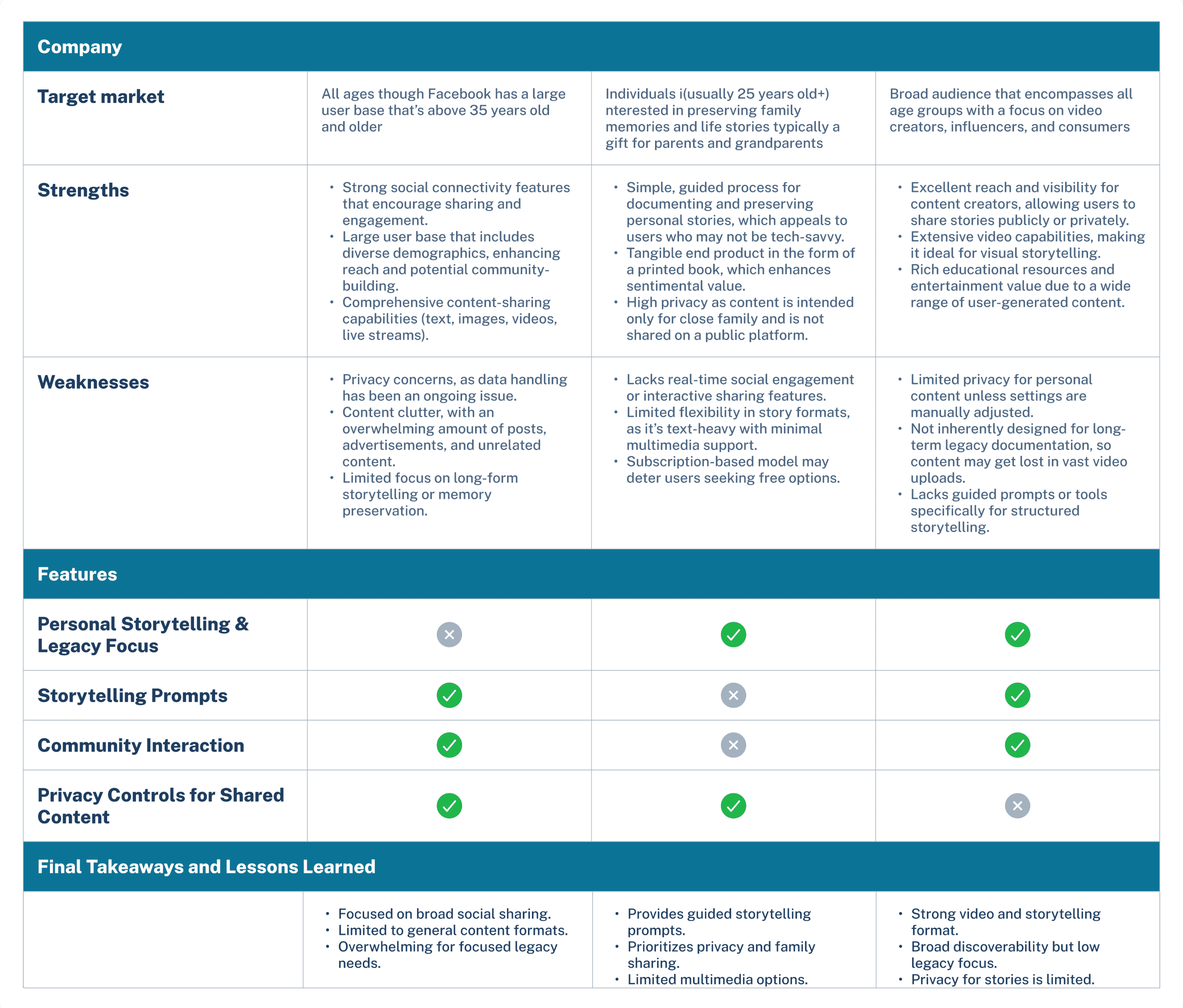
From researching the competitive landscape, I learned the importance of simplified user flows, community-based storytelling, and robust personalization and customization options to enhance user engagement and relevance. However, these platforms often lacked a deep focus on legacy preservation, meaningful gift-giving, and comprehensive onboarding experiences tailored to unique user personas, which MyStory aims to prioritize.
2
Defining
Brainstorming Session
Sitemap
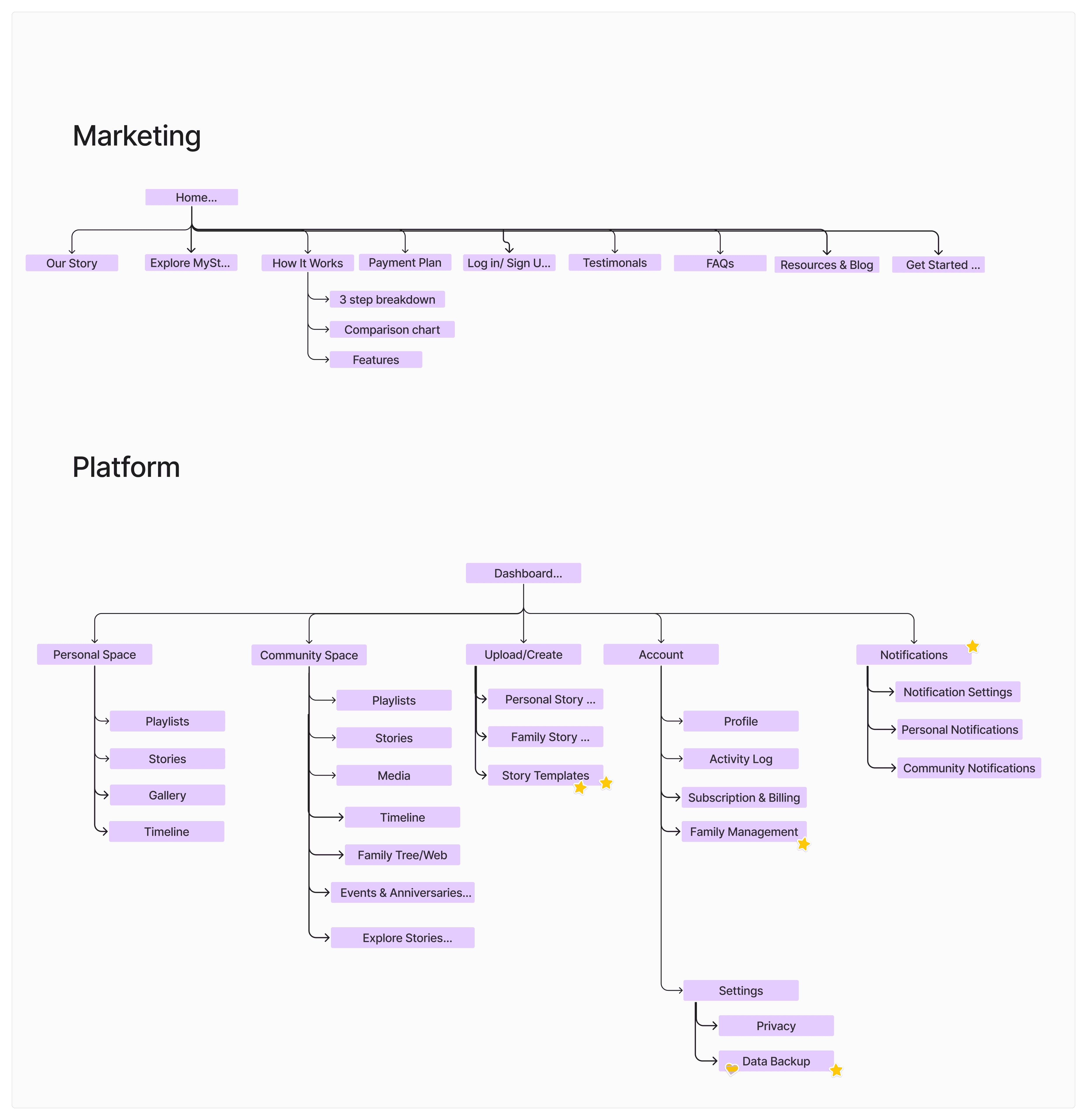
The sitemap visually represents the structured content hierarchy, aiding in identifying user pathways and content relationships. These outcomes informed the development of the user journey flows.
User Flow
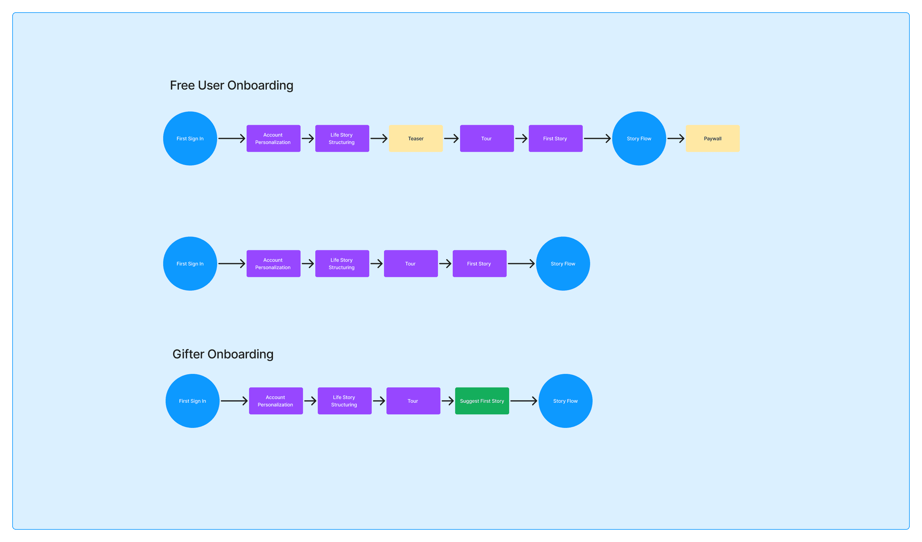
The onboarding flow accounts for 3 types of users. The free user, gifter, and the typical paid user. All of these users encounter similar stages such as account personalization, life story structuring, tour, and first story.
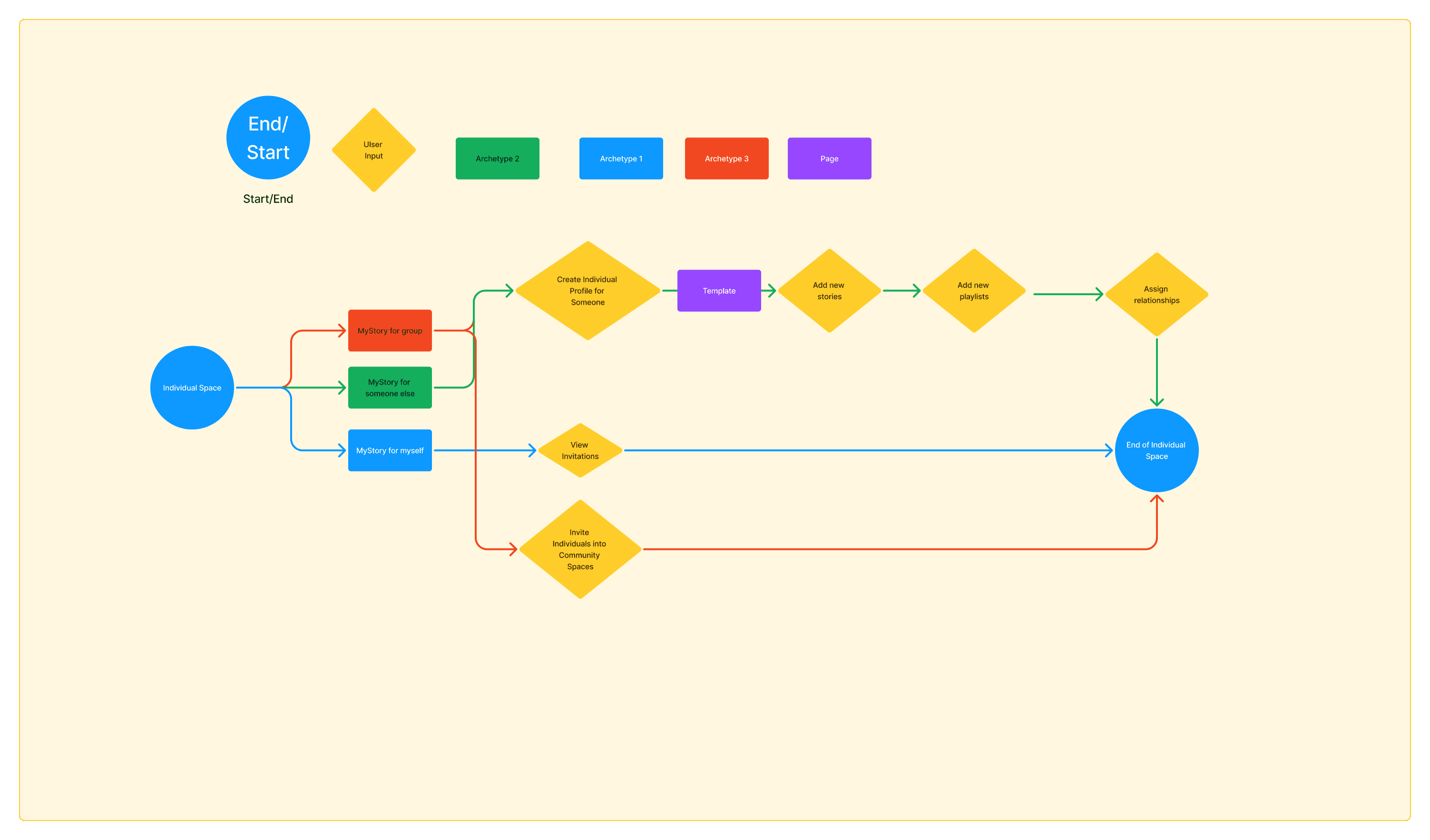
The space creation flow illustrates how the 3 user types create a personalized space in MyStory.
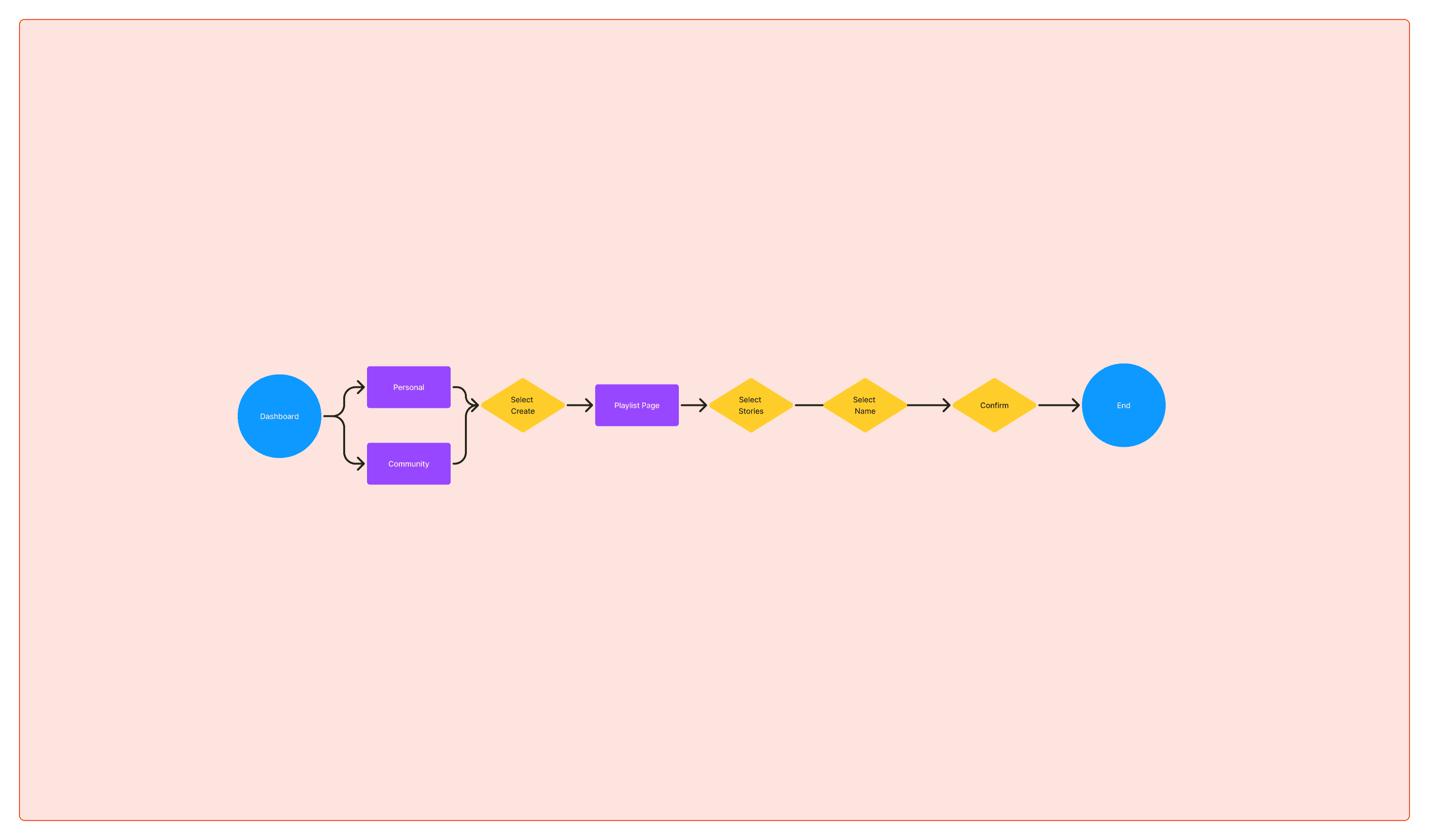
The playlist creation flow illustrates how users create a personalized playlist in MyStory, helping them organize and share significant moments from their lives in an intuitive, streamlined way.
I wanted to visually represent the multiple flows to identify potential pain points, optimize navigation paths, and guide design decisions. Eventually, after feedback from the stakeholders, I narrowed my focus to a singular user flow: the playlist creation flow.
3
Assembling
Lo-Fi Wireframes
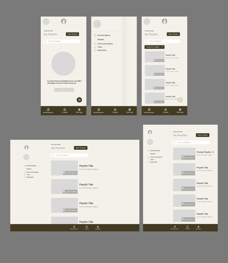
The lo-fi wireframes provided for early revisions and direction for business stakeholders to visualize the UX and UI design more. I was able to gather insights based on their feedback for required enhancements which guided the mid fidelity iterations.
Mid-Fi Wireframes

Through another round of stakeholder feedback, insights were gathered on necessary improvements and informed the subsequent iterations.
High-Fi Wireframes
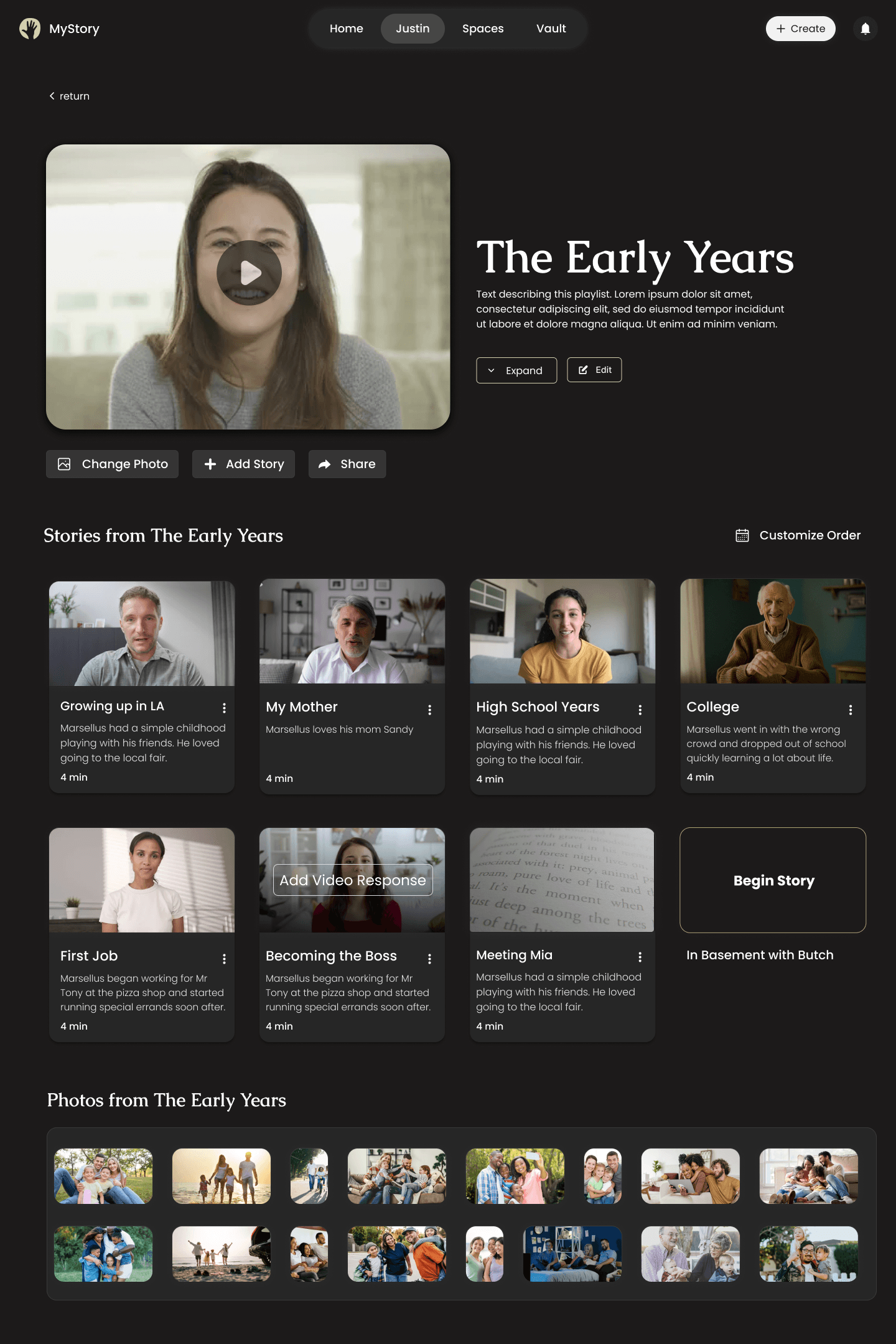


What I tested
Usability Testing
Success Metrics
Sign-up conversion rate
Retention rate
Drop-off rate
Task completion rate
Results
Though yet to be launched, the project remains under development, pleasing the business stakeholders with its outcomes.
Iterations
Design Decisions
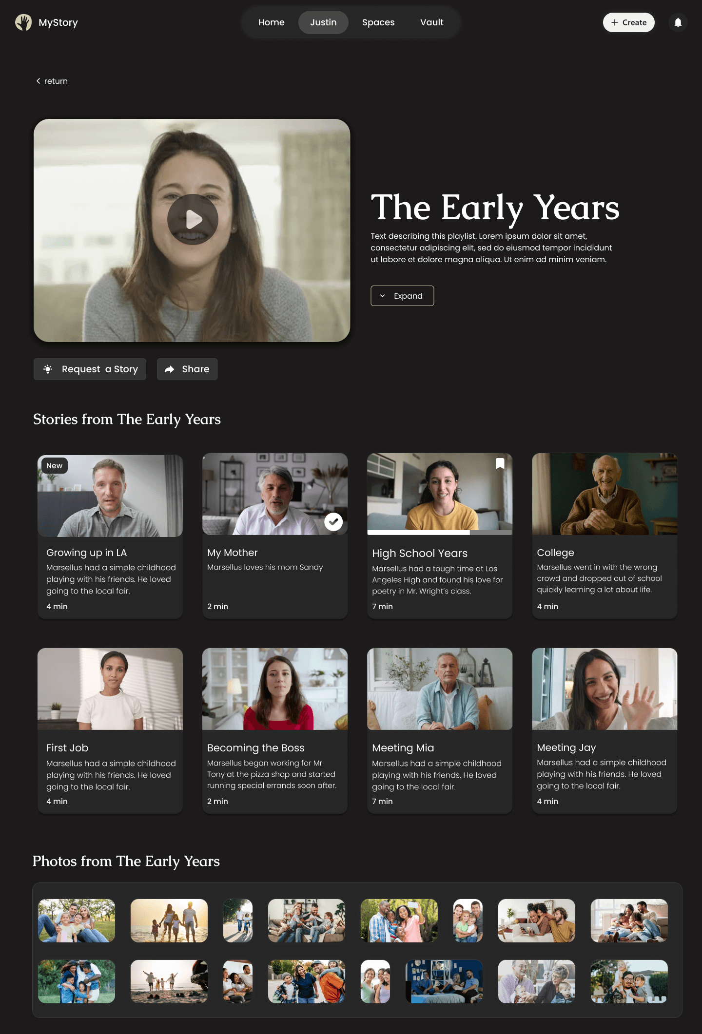
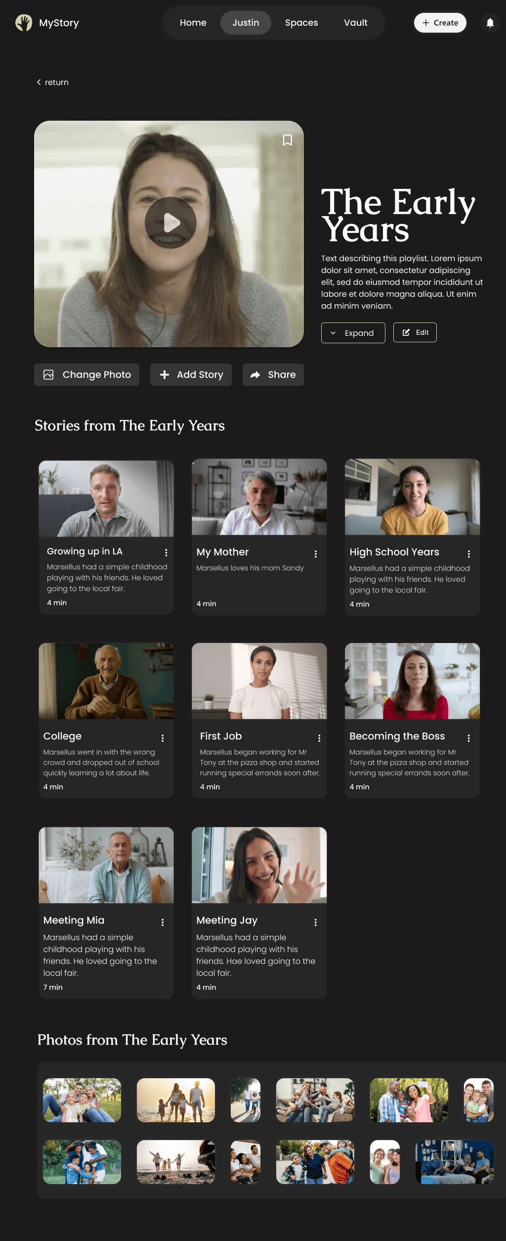
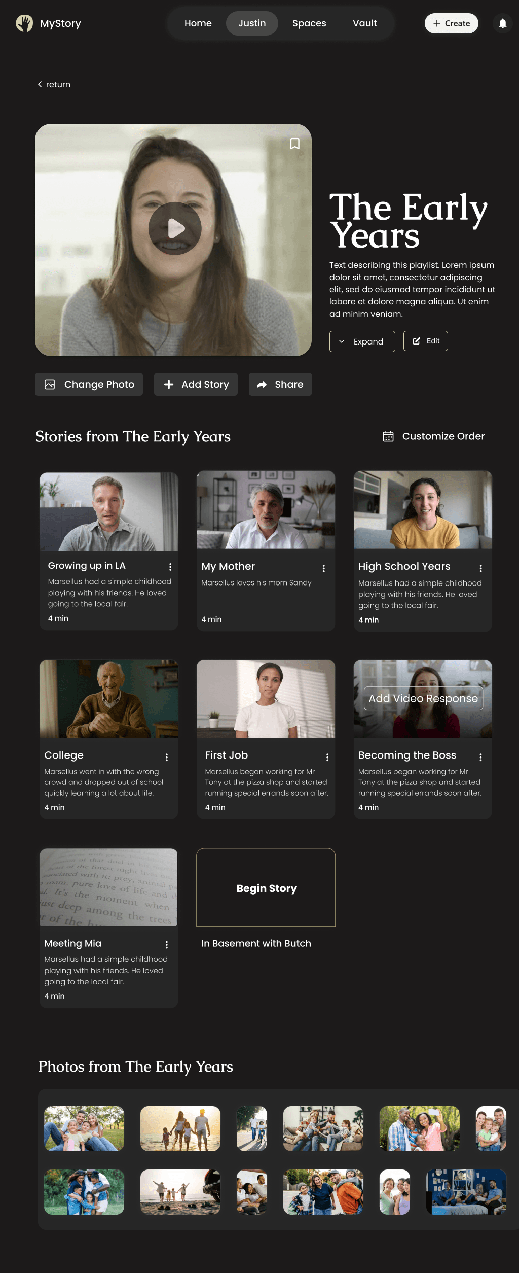
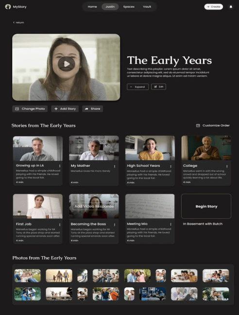
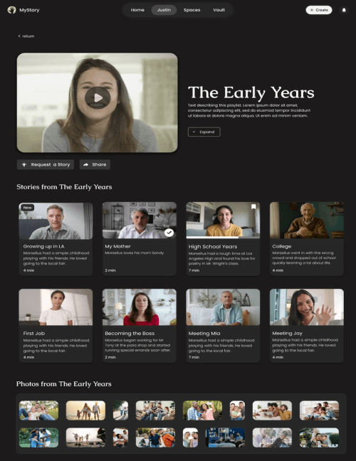
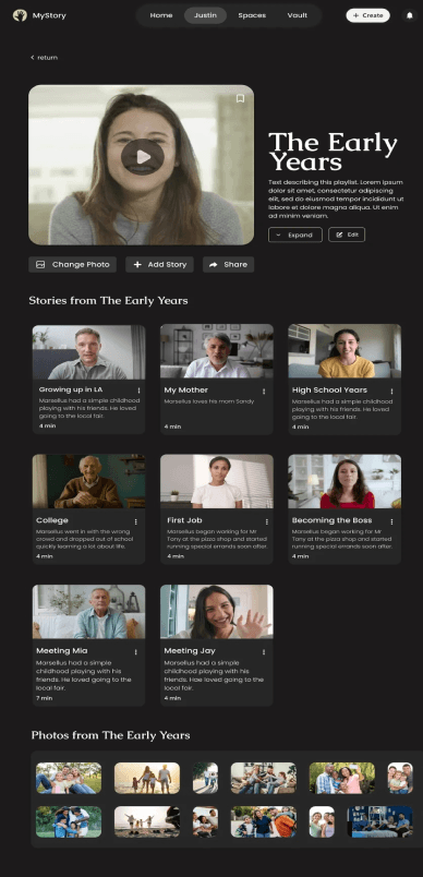
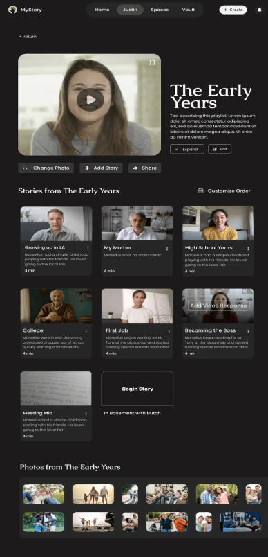
To accomodate an older and younger userbase: we implemented a structured and accessible layout. Features were made to be simple and supportive for extended uses. We also had a more modern, minimalistic, and fluid design to ensure a seamless digital storytelling experience.
Streamlined navigation: A dashboard with visual indicators to help users track their progress, resume activities, and reference completed sections with ease.
Modular storytelling: Flexible storytelling, allowing users to navigate non-linearly. As a result of this decision, it eliminated confusion and offered a more open ended way to answer questions for users.
4
Delivery
Final Screens
Impact and Takeaways
Working with stakeholders, developers, and other designers in real-time and on a real product provided stakes and challenges that influenced design decisions and iterations.
I've learned a lot about collaborating between stakeholders, developers, and other designers, including strong documentation, communication, hand-off, and organization.
@2024 Justin Ngo
Table of Content
Defining
Sitemap

1
Discovering
2
Defining
3
Assembling
4
Delivery
6 Weeks
Timeline
Role
UX/UI Designer &
Researcher
Project
Desktop and tablet
redesign
Tools
Figma, Zoom,
Figjam, Photoshop
What is MyStory?
MyStory is a legacy documentation platform aiming to help users create and share their life stories.
The Initial Investigation
I wanted to explore how to redesign MyStory to create an accessible platform that caters to both older users and younger users familiar with modern digital experiences
I thought of finding similar platforms would help instead I found out a simpler solution.
Simplifying Flows
Alongside the stakeholders and designers, we researched and found critical gaps in the user experience.
We found the inital flow of the platform left too many users disengaged, especially when it came to storytelling and sharing. To reduce the drop-off rate we simplified the flow and left more flexibility for non-linear storytelling and structure.
But where did we start from?
The Process
1.Discovering
Competitor Analysis
2.Defining
Site Map
User Flow
3.Assembling
Lo-Fi Wireframes
Mid-Fidelity
High Fidelity
Design Decisions
4.Assembling
Reflection
The Competition
Competitive Analysis


Storyworth
Youtube

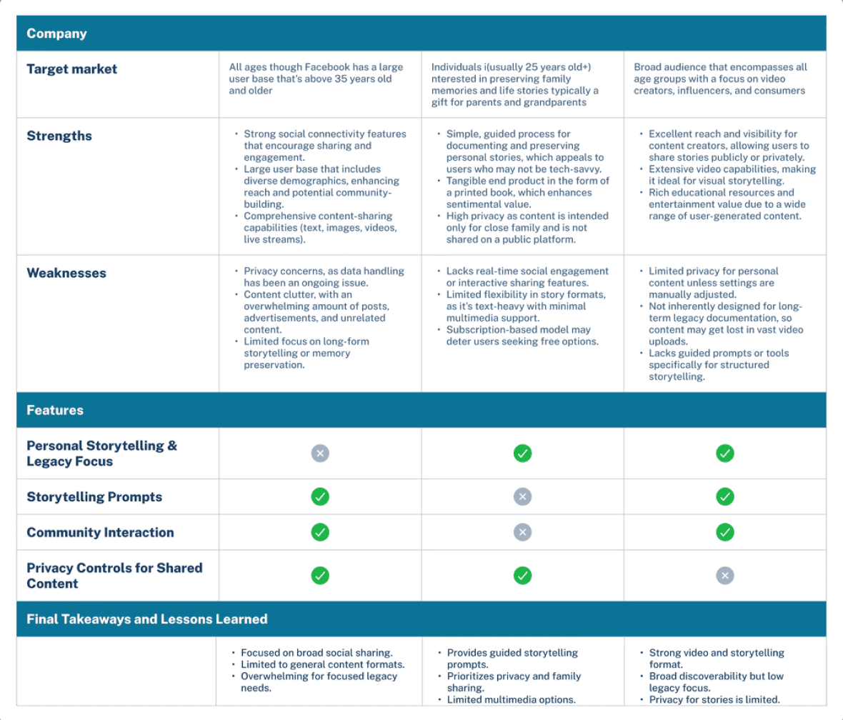
From researching the competitive landscape, I learned the importance of simplified user flows, community-based storytelling, and robust personalization and customization options to enhance user
engagement and relevance. However, these platforms often lacked a deep focus on legacy preservation, meaningful gift-giving, and comprehensive onboarding experiences tailored to unique user personas, which MyStory aims to prioritize.
Brainstorming Session
Sitemap
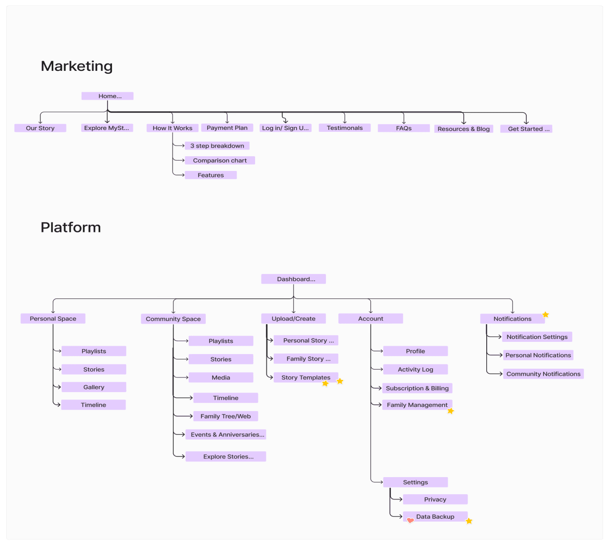
The sitemap visually represents the structured content hierarchy, aiding in identifying user pathways and content
relationships. These outcomes informed the development of the user journey flows.
User Flow

The onboarding flow accounts for 3 types of users. The free user, gifter, and the typical paid user. All of these users
encounter similar stages such as account personalization, life story structuring, tour, and first story.
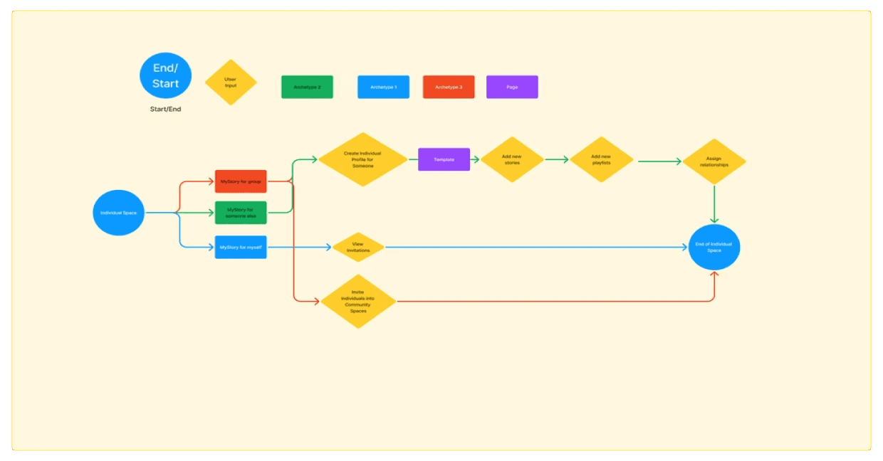
The space creation flow illustrates how the 3 user types create a personalized space in MyStory.
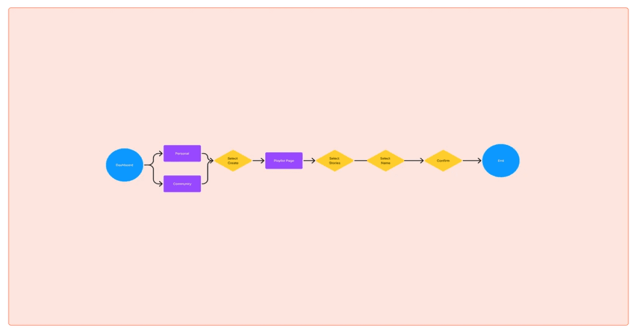
The playlist creation flow illustrates how users create a personalized playlist in MyStory, helping them organize and
share significant moments from their lives in an intuitive, streamlined way.
I wanted to visually represent the multiple flows to identify potential pain points, optimize navigation paths, and guide
design decisions. Eventually, after feedback from the stakeholders, I narrowed my focus to a singular user flow: the
playlist creation flow.
Lo-Fi Wireframes
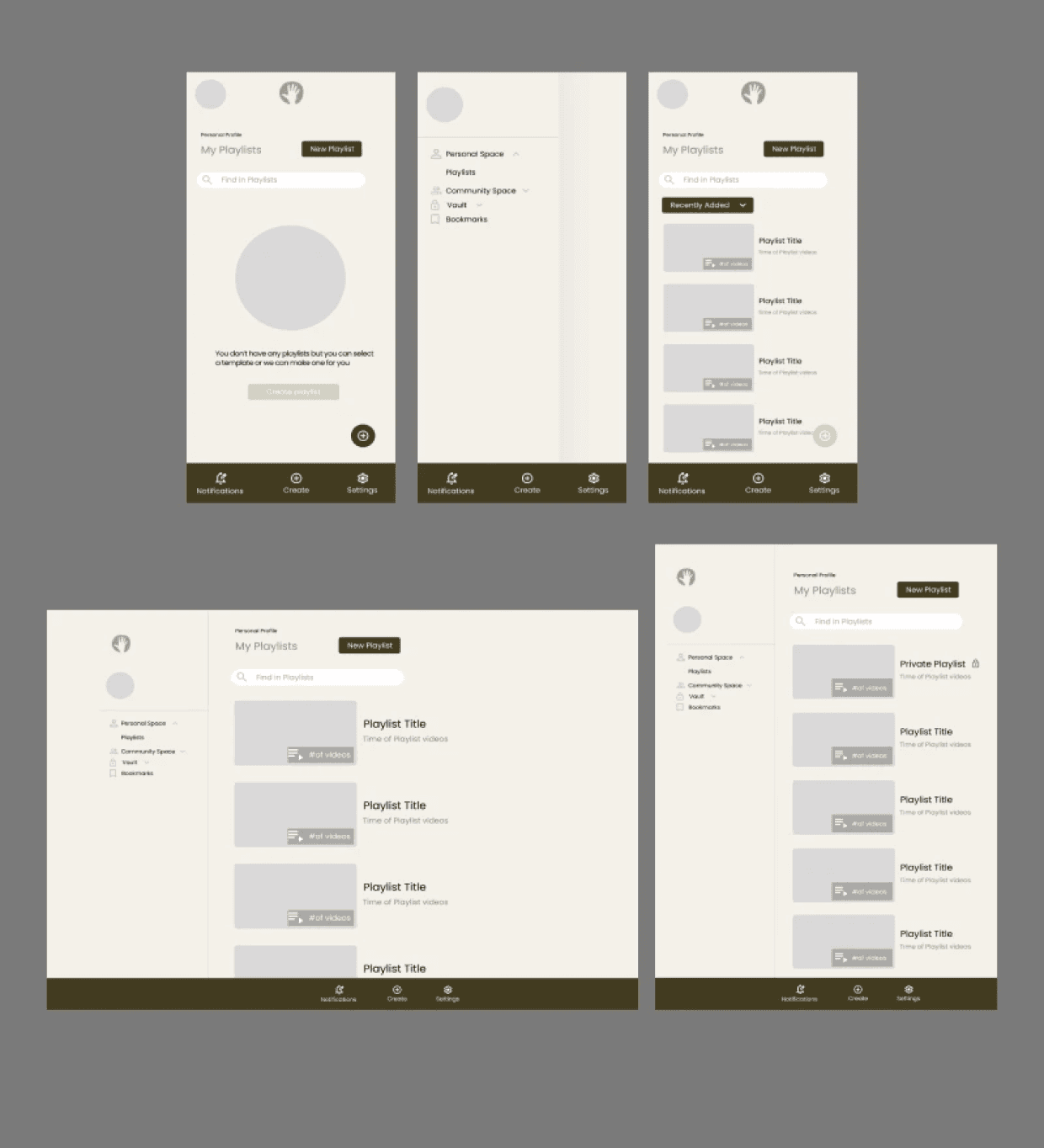
The lo-fi wireframes provided for early revisions and direction for business stakeholders to visualize the UX and UI design more. I was able to gather insights based on their feedback for required enhancements
which guided the mid fidelity iterations.
Mid-Fi Wireframes
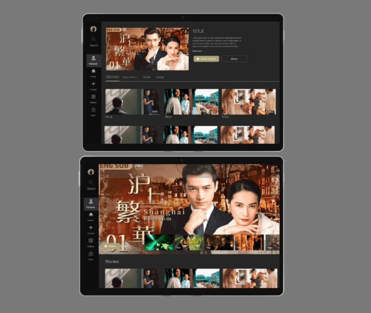
Through another round of stakeholder feedback, insights were gathered on necessary improvements and informed the subsequent iterations.
High-Fi Wireframes


What I tested
Usability Testing
Success Metrics
Sign-up conversion rate
Retention rate
Drop-off rate
Task completion rate
Results
Though yet to be launched, the project remains under development, pleasing the business stakeholders with its
outcomes.
Iterations
Design Decisions
To accomodate an older and younger userbase: we implemented a structured and accessible layout. Features were
made to be simple and supportive for extended uses. We also had a more modern, minimalistic, and fluid design to
ensure a seamless digital storytelling experience.
Streamlined navigation: A dashboard with visual indicators to help users track their progress, resume activities, and
reference completed sections with ease.
Modular storytelling: Flexible storytelling, allowing users to navigate non-linearly. As a result of this decision, it
eliminated confusion and offered a more open ended way to answer questions for users.
Impact and Takeaways
Working with stakeholders, developers, and other designers in real-time and on a real product provided stakes and
challenges that influenced design decisions and iterations.
I've learned a lot about collaborating between stakeholders, developers, and other designers, including strong
documentation, communication, hand-off, and organization.
@2024 Justin Ngo


1
Discovering
2
Defining
3
Assembling
4
Delivery
6 Weeks
Timeline
Role
UX/UI Designer &
Researcher
Project
Desktop and tablet
redesign
Tools
Figma, Zoom,
Figjam, Photoshop
What is MyStory?
MyStory is a legacy documentation platform aiming to help users create and share their life stories.
The Initial Investigation
I wanted to explore how to redesign MyStory to create an accessible platform that caters to both older users and younger users familiar with modern digital experiences
I thought of finding similar platforms would help instead I found out a simpler solution.
Simplifying Flows
Alongside the stakeholders and designers, we researched and found critical gaps in the user experience.
We found the inital flow of the platform left too many users disengaged, especially when it came to storytelling and sharing. To reduce the drop-off rate we simplified the flow and left more flexibility for non-linear storytelling and structure.
But where did we start from?
The Process
1.Discovering
Competitor Analysis
2.Defining
Site Map
User Flow
3.Assembling
Lo-Fi Wireframes
Mid-Fidelity
High Fidelity
Design Decisions
4.Assembling
Reflection
The Competition
Competitive Analysis


Storyworth
Youtube


From researching the competitive landscape, I learned the importance of simplified user flows, community-based storytelling, and robust personalization and customization options to enhance user
engagement and relevance. However, these platforms often lacked a deep focus on legacy preservation, meaningful gift-giving, and comprehensive onboarding experiences tailored to unique user personas, which MyStory aims to prioritize.
Brainstorming Session
Sitemap

The sitemap visually represents the structured content hierarchy, aiding in identifying user pathways and content
relationships. These outcomes informed the development of the user journey flows.
User Flow

The onboarding flow accounts for 3 types of users. The free user, gifter, and the typical paid user. All of these users
encounter similar stages such as account personalization, life story structuring, tour, and first story.

The space creation flow illustrates how the 3 user types create a personalized space in MyStory.

The playlist creation flow illustrates how users create a personalized playlist in MyStory, helping them organize and
share significant moments from their lives in an intuitive, streamlined way.
I wanted to visually represent the multiple flows to identify potential pain points, optimize navigation paths, and guide
design decisions. Eventually, after feedback from the stakeholders, I narrowed my focus to a singular user flow: the
playlist creation flow.
Lo-Fi Wireframes

The lo-fi wireframes provided for early revisions and direction for business stakeholders to visualize the UX and UI design more. I was able to gather insights based on their feedback for required enhancements
which guided the mid fidelity iterations.
Mid-Fi Wireframes

Through another round of stakeholder feedback, insights were gathered on necessary improvements and informed the subsequent iterations.
High-Fi Wireframes


What I tested
Usability Testing
Success Metrics
Sign-up conversion rate
Retention rate
Drop-off rate
Task completion rate
Results
Though yet to be launched, the project remains under development, pleasing the business stakeholders with its
outcomes.
Iterations
Design Decisions
To accomodate an older and younger userbase: we implemented a structured and accessible layout. Features were
made to be simple and supportive for extended uses. We also had a more modern, minimalistic, and fluid design to
ensure a seamless digital storytelling experience.
Streamlined navigation: A dashboard with visual indicators to help users track their progress, resume activities, and
reference completed sections with ease.
Modular storytelling: Flexible storytelling, allowing users to navigate non-linearly. As a result of this decision, it
eliminated confusion and offered a more open ended way to answer questions for users.
Impact and Takeaways
Working with stakeholders, developers, and other designers in real-time and on a real product provided stakes and
challenges that influenced design decisions and iterations.
I've learned a lot about collaborating between stakeholders, developers, and other designers, including strong
documentation, communication, hand-off, and organization.
@2024 Justin Ngo
